Apply Wiz
Project Summary
Girl Develop It (GDI) is an organization whose mission is to create welcoming and supportive opportunities for women and non-binary adults to learn software development skills. Essteem engages companies and talent for social & environmental responsibility and innovation.
GDI and Essteem partnered up for a Women’s History Month hackathon to create a solution for problems that GDI participants often faced upon completing course work.
Spoiler Alert: Our design for Apply Wiz earned 1st place in the hackathon and I was also nominated by my teammates as Design and Research Expert!
Task
Several GDI graduates would like to pay for a service that searches and applies to tech roles on their behalf so that they can spend their time learning new skills or developing their portfolios.
The task is to create a web application (Apply Wiz) where GDI grads can create an account sharing their job preferences and HR Freelancers are able to search and apply to tech roles on behalf of GDI grads.
My Contributions
Competitive & Comparative Analysis
User Flow
Design System - Components
Mid Fidelity Mockup and High Fidelity Prototype
Duration
1 Week
3 Days to Design
4 Days to Develop
My Team
Jennifer Susan, Software Engineer
Melanie Richard, Software Engineer
John Liu, Data Scientist
Abrar Sawani, UX/UI & Resersearch Designer
Dona Das, UX/UI & Resersearch Designer
Robert Chacon, UX/UI & Resersearch Designer
Tools
Challenge Faced Throughout the Project
Being that this was my first hackathon, I was not used to the short timeline we had to design and develop a new app. To mitigate this challenge, the design team created a timeline of what we wanted to accomplish for each day:
Day 1: Competitive & Comparative Analysis, Persona, User Flow, and Sketched Wireframes
Day 2: Mid - Fidelity Mockup and Usability Testing
Day 3: Iterate design based on user feedback, create style guide, and high fidelity mockup
The design team was able to stick to this timeline and deliver a high fidelity prototype on time for the developers and data scientist to begin to do their work.
3 Days to Design
Competitive & Comparative Analysis
We gathered additional information on what features competitors have within their applications/websites and what is missing or could be improved upon.
Persona
Through our user research we created a user persona, Nicole Jackson! She was key to leading our decisions for what our main target users would need and want for the Apply Wiz App.
User Flow
We created a user flow that would take Nicole through the Apply Wiz app from onboarding to applying to a UX/UI Design role.
Lo-Fi Sketches and Mid-Fi Wireframes
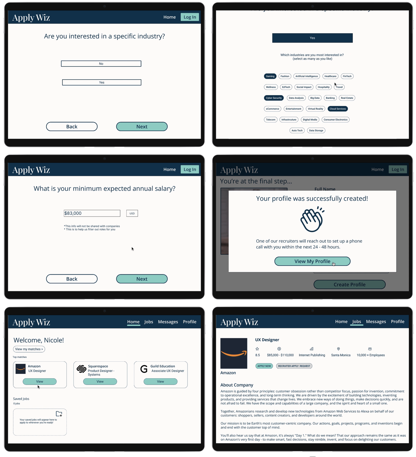
Once our group had created the user flows, we were then able to create sketched wireframes to get an idea of how the Apply Wiz app could look like. From there, we then created a mid-fi prototype.
Usability Testing
Because we only had 3 days to design, we performed one phase of usability testing. We had 6 users to test this app and provide feedback. The tasks and results are as follows:
Tasks
Create an account
View one of your top job matches
Results
Success rate of completing tasks - 100%
Success rate of completing tasks in under 5 mins - 100%
Our team made changes to the app based on user feedback. The following is an example of some of the changes made:
Onboarding Questionnaire Completion Not Clear: After users were done with answering the onboarding questionnaire, they were then taken to their profile homepage that had jobs that would be a great fit for them. 2 out of 3 users weren’t sure if they had completed the questionnaire or if they had jumped a screen. To solve this confusion, the design team implemented an overlay that let’s the users know that they have completed the questionnaire.
Iteration
Style Guide
The brand colors for Apply Wiz were inspired by the GDI and Essteem’s brand colors. We also created a components library to ensure that our work was consistent and efficient throughout the app design.
High Fidelity Prototype
Based on the usability feedback we received from users, we were able to implement changes and create the high fidelity mockup below. Please feel free to click through the prototype using this link.
Next Steps
During the hackathon presentation, our team recommended GDI to explore the following options for future iterations:
Do another round of usability testing for the updates made on iteration #1 and implement user feedback
Add push notifications to alert job seekers of new job matches
Hackathon Results
Our design for Apply Wiz earned 1st place in the hackathon! I was also nominated by my teammates as Design Expert and Research Expert!


