Reddit Overview
Abrar Sawani - UX/UI Designer
Sumit Barua - UX/UI Designer
Robert Chacon UX/UI Designer
Tool
Reddit is an app where you can dive into any topic and make a community with other users. There are over 100,000+ communities. “Redditors” can post content such as links, text posts, images, and videos, which are then discussed and up/down voted by other Redditors.
Task
Identify and design a new feature for an existing app, Reddit, that will enhance user experience.
My Contributions
User Interviews
Affinity Mapping
Competitive Analysis
Mid-Fidelity Wireframes
Problem Statements & HMWs
Group Presentation Slides
My Team
User Interview
We conducted 6 user interviews to identify pain points users have while using Reddit. We categorized the results and created an affinity map to identify potential feature(s) our team could design (see scrolling carousel below).
The top two features:
Be able to organize saved posts and
Allow users to post anonymously without creating a throwaway account
Upon further research, my team discovered that organizing saved posts is a premium feature on Reddit. As a result, we went with the latter feature idea.
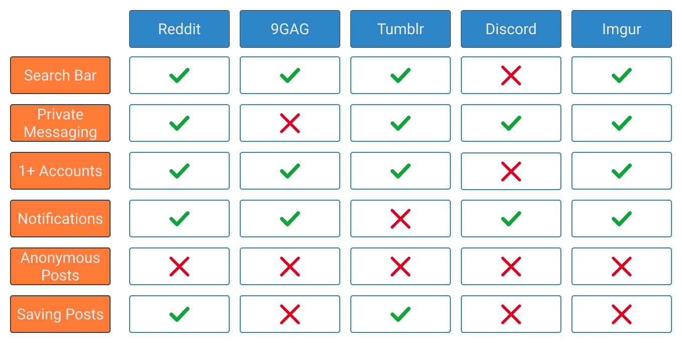
We identified 4 competitor apps/websites that our users also use. Like Reddit, you’d have to create a throwaway account for each of the competitors.
Competitive Analysis
Problem Statement & HMW
Our client, Reddit, wants to implement an anonymous posting feature to enhance users’ posting experiences. Our solution is to generate a fake username and that Original Poster’s history isn’t visible when this feature is being used.
HMW help Reddit users feel safe to post about sensitive topics that might reveal their identity?
HMW help Reddit users post about sensitive topics without creating throwaway accounts?
Persona
Through our user research, problem statements, and HMW statements we were able to create a user persona, Ruben Gomez! He was key to leading our decision for what our main target users would need and want.
User Flow
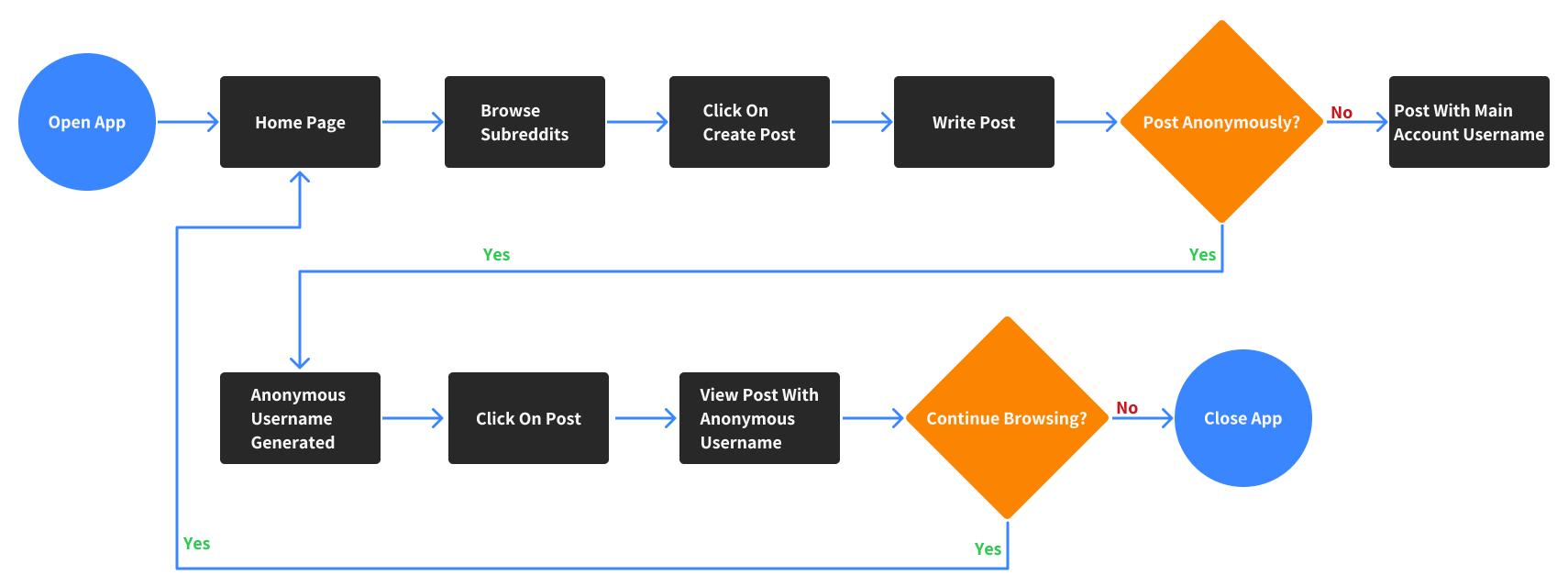
We created a user flow that would allow Ruben to post anonymously from his main Reddit account. We focused on two tasks:
Create a post and use the anonymous feature
View anonymous post after posting it
Sketched Wireframes
We then sketched wireframes based on the user flow.
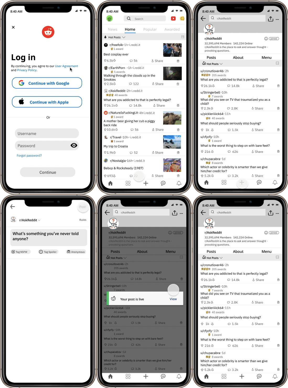
These wireframes demonstrate onboarding, logging in, home page, and create a post page of current Reddit App.
Wireframes 1-5
These wireframes demonstrate how users can use the anonymous feature and check that an anonymous username is attached to the post.
Wireframes 6-9
Mid - Fidelity Wireframes
From the sketched wireframes, we created a Mid-Fidelity wireframes, which helped us get a better visual of the feature we’re adding to Reddit.
Usability Testing
Tasks
Log into Reddit and create a post using the anonymous feature.
View live post to ensure it has a Reddit generated username (not main account username)
Results
Success rate of completing tasks - 100%
Success rate of completing tasks in under 5 mins - 100%
Iteration
Our team made changes to the app based on user feedback. However, there were a few changes we weren’t entirely sure how users would react. Sometimes tweaks to the UI can have unintentional consequences that create friction for users. To resolve this, we did A/B Testing to see how users would react and which changes they preferred.
Make Anonymous Feature More Obvious
Users stated that it was difficult to see if the anonymous feature had been turned on. Option A has the anonymous button green. For option B, when the anonymous feature is turned on, the screen goes on dark mode and buttons turn green. The A/B testing results showed 68% of users preferred option B and therefore we implemented it in our iteration.
“Your Post Is Live” Notification
Users were having difficulty seeing “Your Post Is Live” notification. For option A, we added a green bar next to the message and moved it up a tad. For option B, we were more aggressive with the design by placing a dark overlay and positioned the notification to the center of the screen. The A/B testing results showed 74% of users preferred option B and therefore we implemented it in our iteration.
We used Reddit’s colors and fonts for our high-fidelity prototype.
Style Guide
High Fidelity Prototype
We implemented changes based on the user feedback from the usability testing as well as A/B Testing and created the high fidelity prototype.
Reflections and Next Steps
Since this was one of my first projects, it taught me that what designers expect user to do is often not the case. I learned that A/B Testing is a great way to learn what users will do before we implement new features or redesigns to apps and websites.
If time would have allowed, we would’ve liked to explore the following pain points expressed by our initial user interviews:
A better search engine
A feature to change username at will
A closed caption feature for videos


